10 Of The Best Chiropractic Websites We’ve Seen (And What to Learn From Them)
Introduction
In today’s digital age, a well-designed website is crucial for any chiropractic practice looking to attract new patients and grow its business. A chiropractic website serves as the online face of your clinic, where current and potential patients can learn about your services, read patient testimonials, and even book appointments. With the right design and functionality, your chiropractic site can convert visitors into loyal clients, helping your practice thrive in a competitive market.
When evaluating the best chiropractic websites, we focused on several key criteria: visual appeal, functionality, user experience, and SEO effectiveness. Each of these elements plays a critical role in creating an amazing chiropractic website that not only looks good but also performs well in search engines, bringing in more leads and helping you connect with patients who need your services.
To help make this guide even more practical, we’ve added an “Imagine Your Practice” section for each example. This feature encourages you to think about how these overall design elements could be applied to your own chiropractic website, making it more effective at attracting and converting patients. As you read through each example, consider how you might implement similar strategies to create a website that reflects the quality of care you provide.
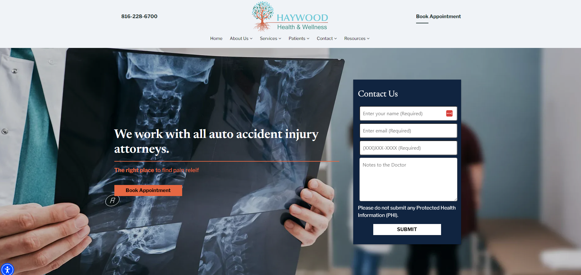
1. Haywood Health & Wellness
What to Note: High-Quality Imagery
One of the first things visitors notice when they land on a chiropractic website is the imagery. At Haywood Health & Wellness, the use of high-quality, eye-catching imagery immediately draws visitors in. The professional images on the site are not just visually appealing; they also build trust and convey a sense of professionalism.
High-quality content, particularly in the form of professional images, can significantly impact how potential clients perceive your chiropractic practice. For Haywood Health & Wellness, the images of treatment areas, patient interactions, and chiropractic services help establish a welcoming and credible environment. This focus on visuals helps potential patients feel more comfortable and confident in choosing their clinic for chiropractic care.
Imagine Your Practice
Picture your practice with similar high-quality imagery that showcases your state-of-the-art treatment rooms and the genuine care you provide to your patients. Potential patients would get a strong first impression, making them more likely to trust you with their chiropractic health care needs.
Ask yourself: Are the images on your website conveying the professionalism and warmth that you want your practice to be known for?
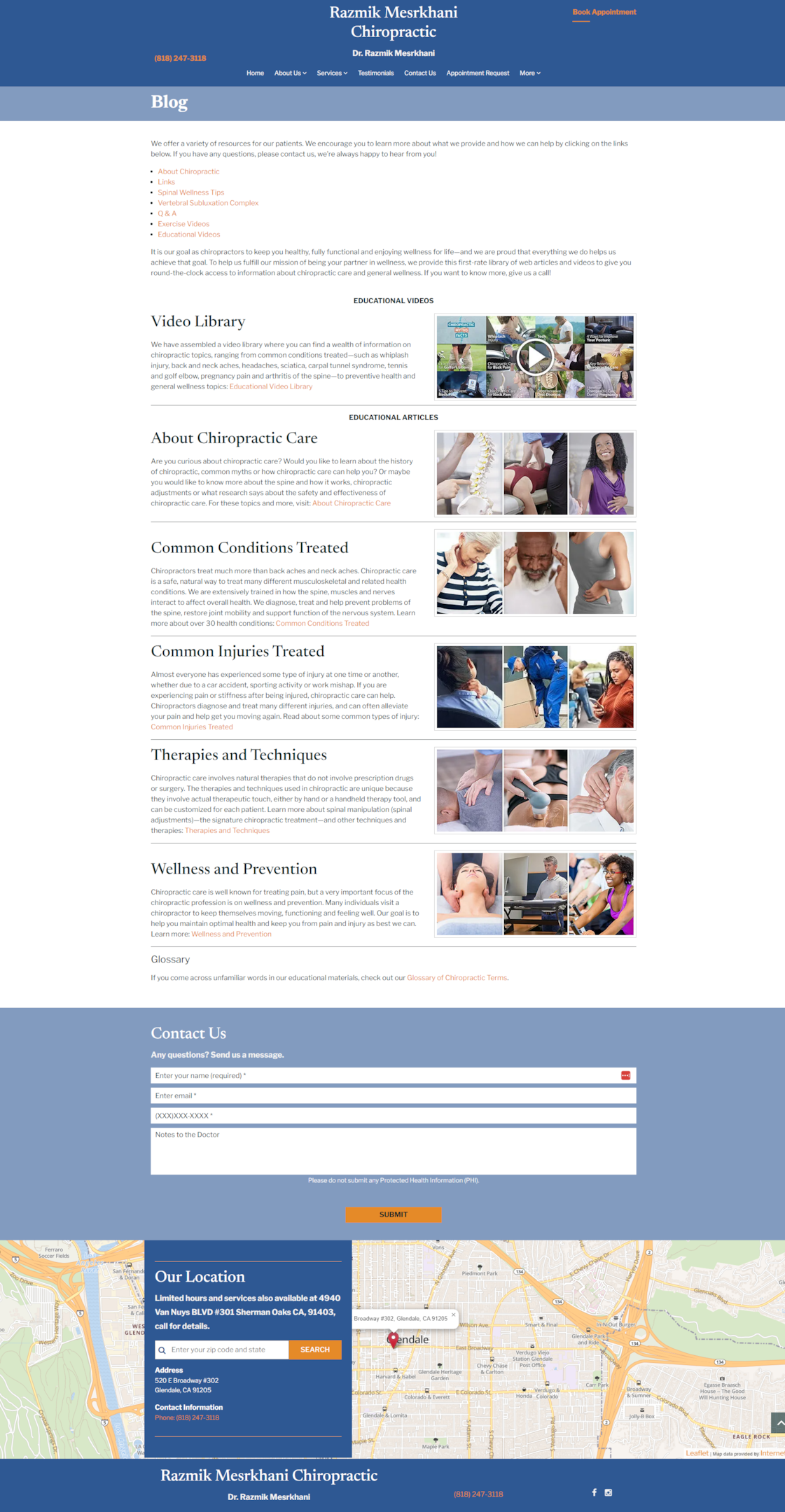
2. Razmik Mesrkhani Chiropractic
What to Note: Organized Blog ‘Home’ Page
In the digital chiropractic world, content is king. Razmik Mesrkhani Chiropractic stands out with its clean and well-organized blog home page. Instead of overwhelming visitors with a wall of text, the blog is neatly categorized, making it easy for website visitors to find the information they’re looking for.
This organized approach not only improves user navigation but also benefits SEO. By categorizing content effectively, the site ensures that search engines can easily index and rank the pages, leading to more organic traffic. For a chiropractic site, having a blog that is both engaging and SEO-friendly is an important element in attracting more visitors and converting them into new patients.
Imagine Your Practice
Think about how a well-organized blog can address the questions and concerns of both current and potential patients. By offering valuable content categorized for easy access, your website becomes a go-to resource in the chiropractic profession, improving your site’s SEO and bringing in more patients who are seeking the best chiropractic care.
Ask yourself: Is your blog content easily accessible and organized to help both new and returning visitors find the information they need?
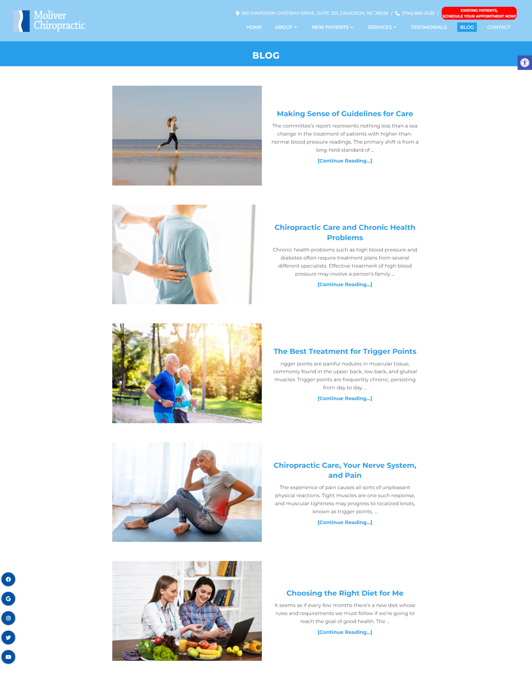
3. Moliver Chiropractic
What to Note: Effective Use of Social Media Widgets
Incorporating social media widgets into your website is a great way to enhance connectivity and expand your online presence. Moliver Chiropractic does this particularly well, with social media icons strategically placed on their blog page.
By linking to social platforms, Moliver Chiropractic not only increases engagement but also boosts SEO. Search engines like Google take social signals into account when ranking websites, so having an active presence on social media can help your chiropractic website rank higher in search results. Additionally, these widgets make it easy for website visitors to follow the practice on various platforms, leading to more positive reviews and greater visibility online.
Imagine Your Practice
Envision your practice with a similar online marketing solution, where social media widgets seamlessly integrate into your chiropractic website design. This not only helps with SEO but also makes it easier for current and potential patients to connect with you across platforms. An amazing chiropractic website that harnesses the power of social media is more likely to attract new patients and grow your practice.
Ask yourself: How well is your website integrating social media to extend your practice’s reach and improve patient engagement?
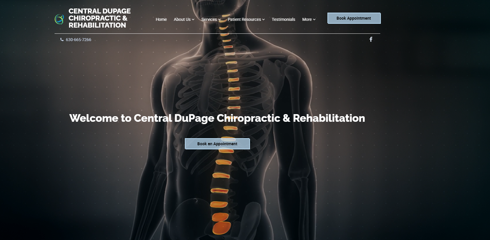
4. Central DuPage Chiropractic & Rehabilitation
What to Note: Bold and Dynamic Home Page
First impressions matter, and Central DuPage Chiropractic & Rehabilitation makes a strong one with its bold and dynamic home page. Featuring an animated spine simulator in the background, this site grabs attention from the moment visitors land on it.
Interactive elements like the spine simulator not only make the site more memorable but also engage visitors in a unique way. This type of innovative design helps differentiate the practice from competitors and leaves a lasting impression on potential patients. For chiropractic websites, incorporating interactive and dynamic elements can significantly enhance user experience and lead to higher engagement rates.
Imagine Your Practice
Imagine pulling up your chiropractic website and being greeted with a bold, interactive element on your homepage that instantly captures the attention of visitors. This kind of engaging design could set your site apart as one of the best chiropractor websites, increasing the likelihood that visitors will explore further and eventually book an appointment.
Ask yourself: What interactive elements could you incorporate into your site to make it more engaging and memorable?
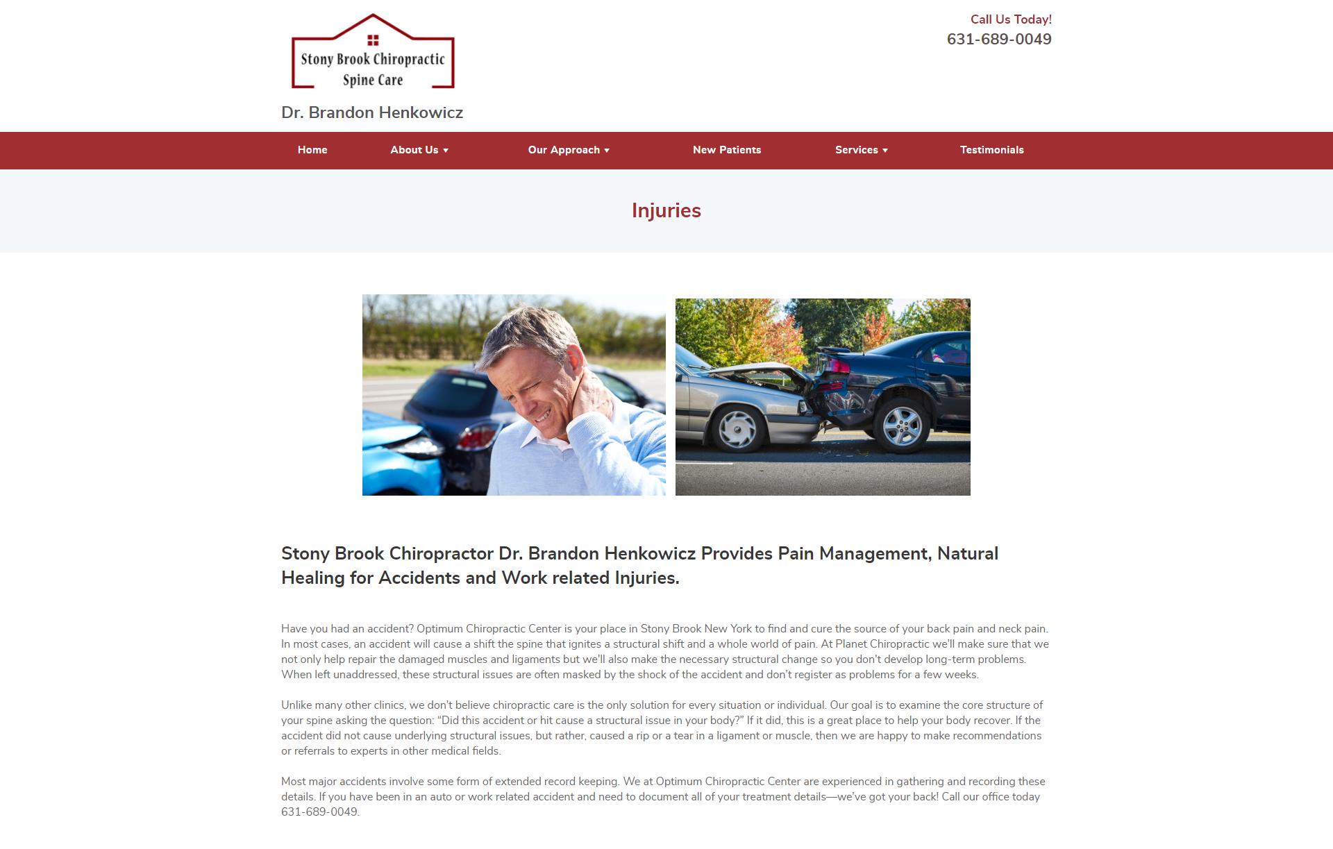
5. Stony Brook Chiropractic Spine Care
What to Note: Consistent Branding and Visual Appeal
Consistent branding is key to building a recognizable and trustworthy online presence. Stony Brook Chiropractic Spine Care excels in this area by using a consistent color scheme and visually appealing images throughout its website.
By maintaining visual consistency, the site ensures that visitors immediately recognize the brand, whether they’re on the homepage, a services page, or a blog post. This consistency not only strengthens brand identity but also makes the website more enjoyable to navigate. For a chiropractic office, where professionalism and trust are paramount, a well-branded site can make all the difference in converting visitors into patients.
Imagine Your Practice
Think about a consistent color scheme and visual appeal that reinforces your brand identity. Potential patients visiting your chiropractic website would feel a sense of trust and familiarity, encouraging them to explore your various services. This approach to branding is essential in creating an amazing chiropractic website design that stands out in the chiropractic industry.
Ask yourself: Is your website’s branding consistent across all pages, and does it effectively communicate your practice’s identity?
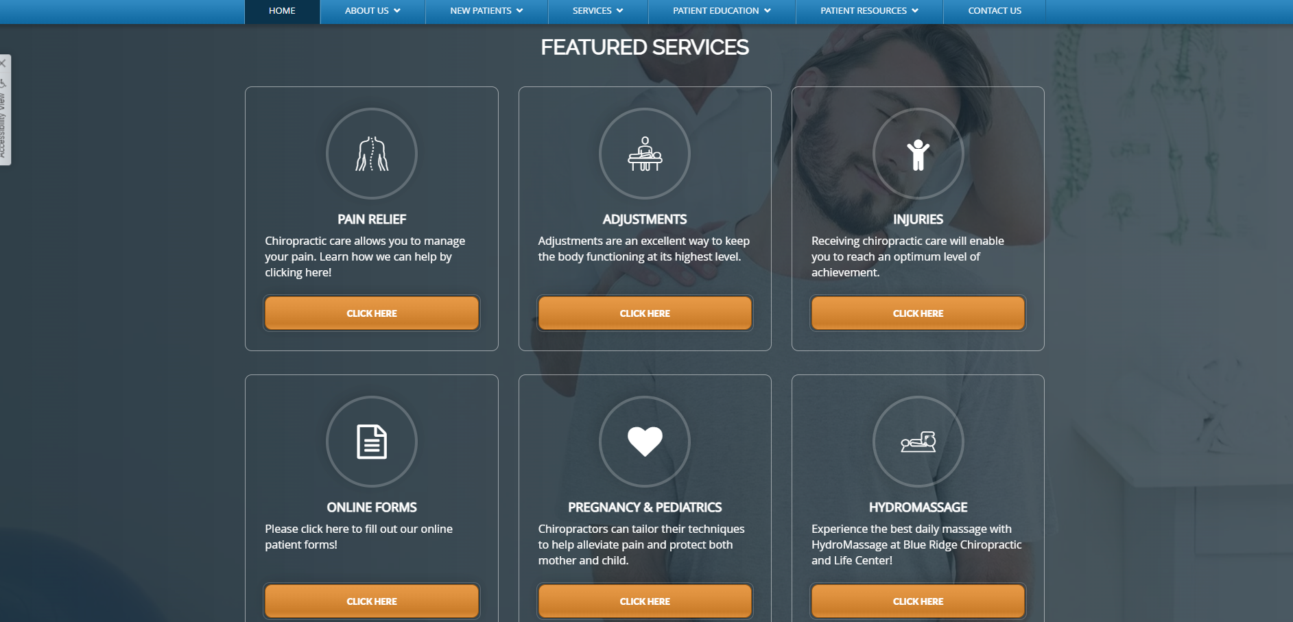
6. Blue Ridge Chiropractic
User-Friendly Navigation
A user-friendly website is essential for keeping visitors engaged and helping them find the information they need. Blue Ridge Chiropractic has done an excellent job of creating a homepage that’s easy to navigate, with treatment pages and featured service buttons prominently displayed.
The site also benefits from a sticky navigation bar that follows visitors as they scroll through the pages. This feature allows for more detailed searching without forcing users to scroll back to the top of the page. Easy-to-use navigation like this not only improves user experience but also encourages visitors to explore other pages on the site, increasing the chances that they’ll book an appointment or learn more about the services offered.
Imagine Your Practice
Imagine your website with intuitive navigation that guides visitors seamlessly through your services and every chiropractic treatment you offer. A user-friendly layout like this could lead to more patients discovering the full range of your chiropractic care, ensuring they find the exact information they need to make informed decisions about their health.
Ask yourself: Is your website easy to navigate, allowing visitors to find the information they need quickly and efficiently?
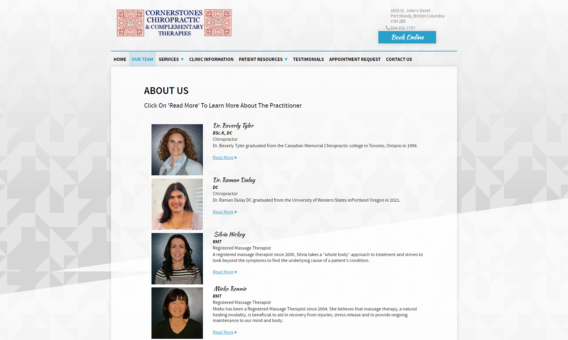
7. Cornerstones Chiropractic & Complementary Therapies
What to Note: Comprehensive and SEO-Friendly Staff Page
One of the standout features of Cornerstones Chiropractic & Complementary Therapies is its comprehensive staff page. The page includes organized photos and simple biographies for each staff member, making it easy for visitors to learn more about the practitioners.
This approach is not only user-friendly but also great for SEO. By including detailed biographies and photos, the site provides rich content that can be indexed by search engines, boosting the site’s visibility. Moreover, these staff pages can lead to more detailed profiles or blog posts, further enhancing the site’s SEO and giving potential patients more reasons to choose this chiropractic practice.
Imagine Your Practice
Picture a detailed and visually appealing staff page that introduces each member of your chiropractic team. This not only builds trust with potential patients but also enhances your site’s search engine optimization, making it easier for new clients to find your practice online. An SEO-friendly staff page is an important element in creating a holistic and engaging chiropractic website.
Ask yourself: Does your staff page effectively introduce your team and contribute to your site’s overall SEO?
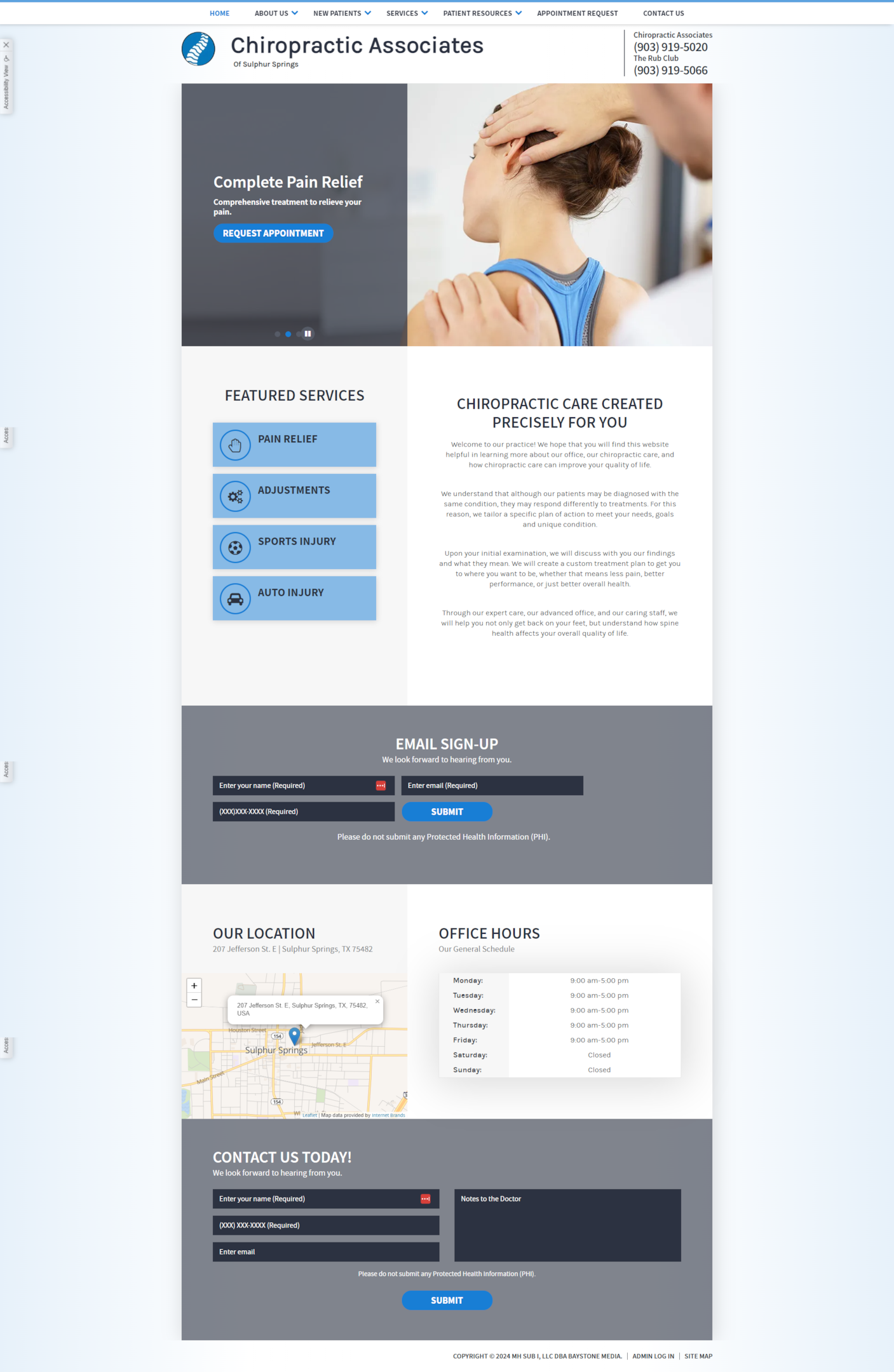
8. Chiropractic Associates of Sulphur Springs
What to Note: Simple, Direct Home Page
Sometimes, less is more. Chiropractic Associates of Sulphur Springs demonstrates the power of a simple, direct home page. The site includes basic information about the practice, contact details, and clear calls to action, making it easy for visitors to get the information they need.
This simplicity is effective because it minimizes distractions and guides visitors toward the most important elements of the site—like booking an appointment or learning about services. The inclusion of featured services call-to-actions (CTAs) helps direct visitors to specific pages if they need more detailed information, making the site both user-friendly and efficient.
Imagine Your Practice
Envision a clean layout that guides visitors effortlessly to your key services. A straightforward homepage that highlights your practice’s most marketable elements can make a significant impact, converting more site visitors into patients.
Ask yourself: Does your homepage effectively highlight your key services and guide visitors toward taking action?
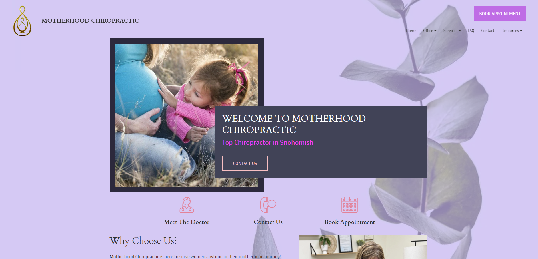
9. Motherhood Chiropractic
What to Note: Unique and Themed Design
Motherhood Chiropractic stands out with its unique and themed design, tailored specifically for maternal chiropractic care. The bold color choices and specialized imagery create an immediate connection with the target audience—expectant and new mothers.
A themed design like this is not just visually appealing; it also helps the practice stand out in a crowded market. By focusing on a specific niche, Motherhood Chiropractic effectively connects with its ideal clients and establishes itself as a trusted provider in maternal health services. This type of targeted design can be particularly effective in attracting more new patients who are looking for specialized chiropractic treatments.
Imagine Your Practice
Think about your specialties. Imagine your website with a themed design that resonates deeply with your target audience, whether it’s families, athletes, or seniors. A focused design like this can help your practice stand out as a leader in your niche, attracting new patients who are looking for specialized care.
Ask yourself: Does your website’s design reflect your practice’s specialty and connect with your target audience?
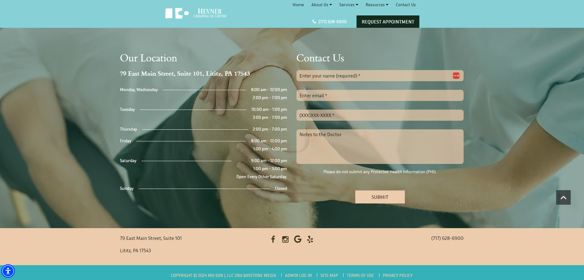
10. Hevner Chiropractic Center
Clear Contact Information and Accessibility
A well-designed chiropractic website should make it easy for visitors to get in touch. Hevner Chiropractic Center excels in this area by providing clear contact information, including hours of operation, location, and a simple contact form.
In addition to the contact details, the site includes social media icons, allowing visitors to connect with the practice on various platforms. This combination of easy access and expanded reach helps the practice connect with potential clients and keep existing patients informed. For any chiropractic clinic, clear contact information and accessibility are crucial elements that can significantly impact patient acquisition and retention.
Imagine Your Practice
Picture clear, easy-to-find contact information, making it simple for potential patients to get in touch. Whether it’s your phone number, email, or social media links, ensuring accessibility can lead to more patient inquiries and bookings.
Ask yourself: How easy is it for visitors to find your contact information and reach out to your practice?
Conclusion
Having a well-designed chiropractic website is essential for attracting new patients, building trust, and standing out in a competitive field. The examples we’ve shared demonstrate how thoughtful design, user-friendly navigation, and strategic use of imagery and content can make a significant impact on your practice’s success.
But these examples are just the beginning. By asking yourself key questions and imagining how these best practices can be applied to your site, you can start to see how simple changes can lead to big improvements. Whether you’re looking to revamp your current site or starting from scratch, drawing inspiration from these sites is a great first step.
Why stop there? Take the next step and explore a gallery of tailored chiropractic website designs that can elevate your practice’s online presence. Discover how an amazing chiropractic website can be the cornerstone of your online marketing strategy, helping you connect with more patients and grow your practice.
View Online Chiro’s Website Designs and Packages
Discover design inspiration for your chiropractic practice by viewing Online Chiro’s website designs and packages. Whether you’re launching a new website or looking to revamp your current one, explore options that match your unique needs and goals. As a leading website provider, Online Chiro offers packages that fit your budget and help you achieve your objectives.
Preview Your New Website Now!

Tiffany Beveridge is a seasoned writer and content strategist with over a decade of experience in creating compelling digital content. She believes access to affordable, premium chiropractic care should be available to all people, regardless of status. Tiffany enjoys being able to write content that helps grow chiropractic practices and make it more accessible to all patients.